
For colours there's no real right and wrong, simply select a light, mid and dark of combos that work well so for this I chose a yellowy brown as it gave her a golden glow :)
Promarkers I'm using today are...
PRIMROSE
PASTEL YELLOW
CINNAMON
SOFT PEACH FOR THE CHEEKS
SANDSTONE (INTERMEDIATE PART)
COCOA (INTERMEDIATE PART)
STEP 1 - Colouring most things including animals uses pretty much the same process, identifying your highlights and shadows. From the hair tutorial I showed you how I do this by colouring with my lightest colour first to bring the image more to life so I can see the points easier.
Here I have used the lightest PRIMROSE and coloured in a large part leaving some points white at this stage.
Next take your PASTEL YELLOW and go over most of your PRIMROSE just as you do for hair and leave a bit of the primrose and white showing where you want your hightlights.
On this image I have picked out above the eyes and on the muzzle, part of the left arm and chest.
In colouring fur and the like I colour in a slightly different way, I don't want smooth glossy features like you get with skin tones and hair I want it a bit rough looking so I scribble when I colour in fur. Start from the outer edges and push the pen in towards your highlight points in a scribbly fashion, not unlike a kid colours if you're with me lol!
On this first pic I've used the primrose and pastel yellow.

STEP 2 - Take your CINNAMON and again starting from the outer edges of each section colour inwards over part of the pastel yellow you just coloured.

STEP 3 - Add some SOFT PEACH for cheeks on either side of the nose in the bit you left white. You can be quite bold with this as it will blend in.
Next use your PRIMROSE to blend in all the colours. Literally just scribble it on as we're not looking for glossy here.

STEP 4 - Add in more PASTEL YELLOW over your first layer to build up some depth. Re-add some SOFT PEACH on the cheeks too. You can see the pastel yellow clearer on where the mouth should be and how its scribbled on :)
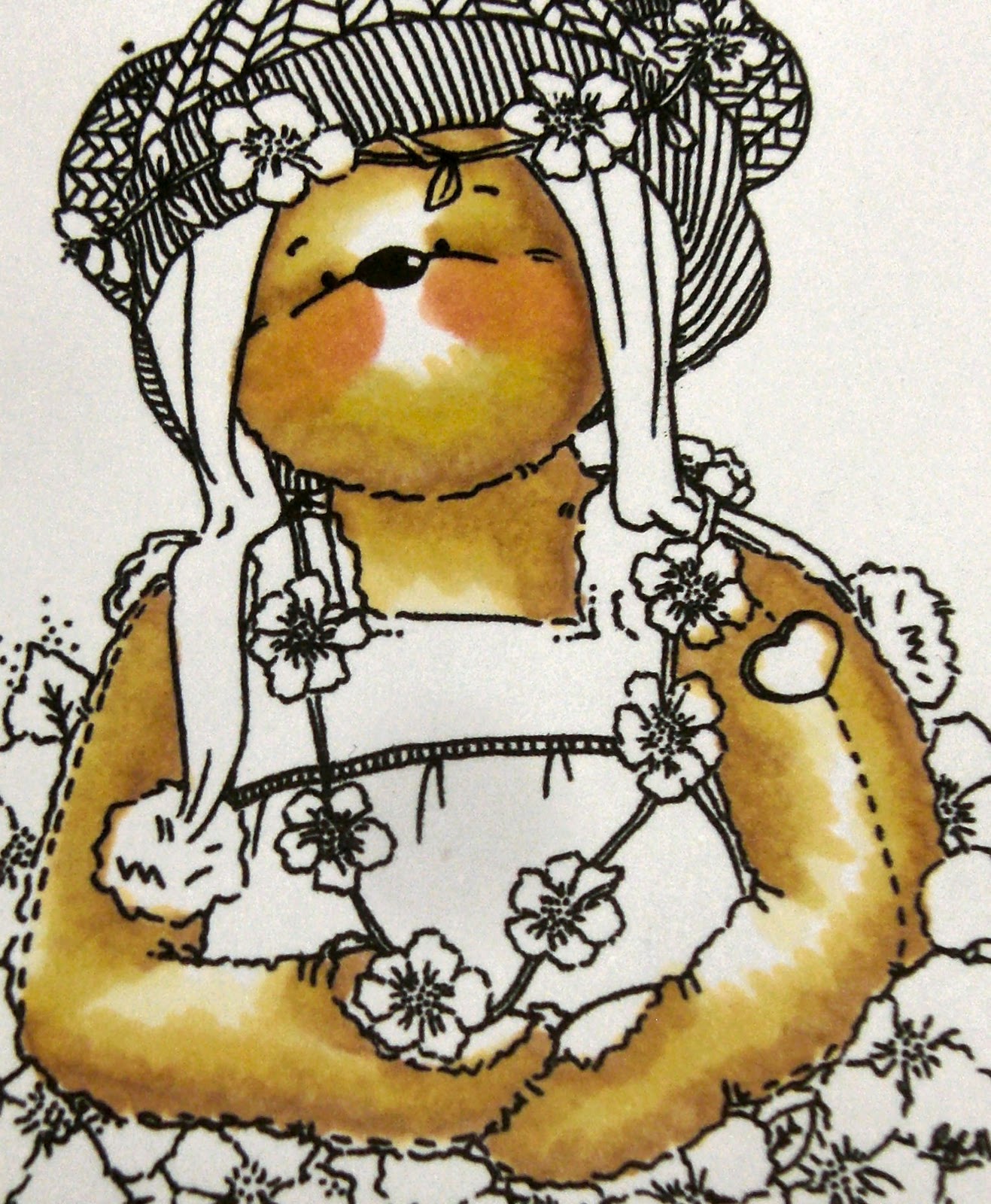
STEP 5 - Again use your CINNAMON and add this to your darkest shadows. Bring a line from the eye outwards and around the frame of the face, under the chin will be quite dark and the inside and ouside of the arms and around the paws.

STEP 6 - Add a little more PASTEL YELLOW over the CINNAMON then use your PRIMROSE to blend it all in. This is perfectly fine as it is, add a dot of white gel pen on the top of the cheeks if required but thats job done...

INTERMEDIATE
Now you've got the hang of that one and are identifying the shadows and highlights a little better we can add in another couple of colours
STEP 7 - If you're feeling confident you can add in an extra couple of colours so here I've added on some SANDSTONE. That shade sits between the cinnamon and pastel yellow so add this on going over and past the parts you previously coloured with cinnamon.

STEP 8 - Now re-add some CINNAMON where you previously coloured.

STEP 9 - Here's the brave bit, add some COCOA around the very darkest parts so here it is the line on the eyes, down the edge of the face, under the chin, under the paws, inside and outside of the arms. You dont have to do solid lines, just scribbles remember and if you miss a bit out thats good as it will give it a more natural look

STEP 10 - Add more PASTEL YELLOW and PRIMROSE in as you did in step 6 to blend them all in again.

STEP 11 - Give a final touch up with the COCOA whilst the ink is still wet and you're done!

Please do experiment around with colours as everyone has their preferences. This one below uses SATIN, SANDSTONE and CINNAMON. I think that would work better for Lily of the valley ones but thats my personal opinion so do experiment as you might like another combo more :)

And the finished article. They always look better when you bring them all together :)

4 comments:
Fab tutorial thanks hun, he looks terrific, sue,x
Hi Vix, these Tutorials are great - it's amazing how many different colours and effects you can get isn't it? I love the softness and the balance of light you have achieved on these - fabby! Hugs, Teresa x
These tutorials have been sooooo much help to me and i have also sent some new crafters to check out your blog, I know posting these must take ages and i thank you from my heart xxxxxx
Hey thanks so much for this wee tut! Just waiting to download my new Teddies on my desktop so I can play around with my pens! Know they will not look anything like yours
he he:((
Sheila:)X
Post a Comment