Wednesday 30 September 2009

TUTORIAL - BLACK HAIR (WITHOUT A BLACK!)

PLEASE ALSO SEE MY 2012 SERIES OF PROMARKER TUTORIALS HERE!

This tutorial is for creating BLACK hair without a black using only 2 pens! Remember all my promarker & copics tutorials are shoestring ones. There are plenty of other tutorials available for using more colours such as on passion for promarkers blog so my tutorials are designed for people with limited colours or thse thinking of trying them out and wanting to only get a few colours to start off with.
You will need the following...

PROMARKERS
Cool Grey 1 (or 2)
Cool Grey 5

COPICS
(Same)


STEP 1

Colour parts of your hair in the cool grey 1 leaving a band of white where the light will reflect (usually a bump on the hair)
STEP 2
Take your cool grey 1 and touch the nib onto the cool grey 5 as shown, it wont damage it! This will give you a cool grey 3 ish. If you're using copics scribble a bit off onto scrap paper first as the concentration will be too strong.
STEP 3

After picking up some of the colour from the cool grey 5 onto your cool grey 1 blend this over the cool grey 1 leaving a bit showing and not going into the white. Repeat this step as necessary to build up some tone.


STEP 4
Using the cool grey 5 colour onto the image leaving some of your blended tones and white showing. This works better if your ink is still a bit wet from the previous step.


STEP 5

Use your cool grey 1 and start to push the darker grey into your blended area and into the white, leave parts of this showing as required. You'll see how the cool grey 1 dilutes the 5 in the pic below creating more tone.

STEP 6
Using your cool grey 5 put on larger areas leaving some of your blended tones and white showing.


Step 7
Again with your cool grey 1 push the colour into the blended areas and repeat as required leaving a small band of white and several tones showing. To finish put a small amount of cool grey 5 on without blending.

This is one done on an Anya stamp using the same method.

Tuesday 29 September 2009

Must be my lucky day :D:D:D

Thanks Marsha for telling me I'd been immensely lucky and won the Victoria Case blog candy to celebrate her new releases at SCACD! Wow I've never won a blog candy before so I'm thrilled! Thank You!

AND! I won a Top 5 blinkie at Passion for Promarkers for my Mo Manning image wallet, woo hoo! I'm so chuffed! I've not been using promarkers very long but am slowly building up my collection!

Saturday 26 September 2009

Autumn is here

Well summer's been and gone.... Well its gone, I don't know if its actually been....

There's a few of autumn challenges this week and I totally looooove this stamp by Elisabeth Bell for SCACD (Available at Quixotic) called Rian. She just says Autumn to me :)
I've used the sketch from Papertake Weekly which is the T sketch as I call it and happens to be one of my favourites (easily the one I do the most) so that also meets the criteria over at Stamp Something which is favourite sketch.
My time to craft, Stamp with fun and Allsorts are all autumn themes this week and Pile it on is punches so I'm entering for them also and the card is for the world cardmaking swap on do crafts!
OK, base card is starburst stains in Cajun carnelian red from the mardi gras set Its a rich orangy golden colour. Background paper is I think HOTP and then the rest of the papers are starburst stains in a variety of colours and mixes. I used a maple leaf punch on a sheet of mixed autumn colours so there is a variety of leaves in different colour stages like green, orange, yellow and brown. Image was coloured with promarkers using almond, blush, vanilla, pastel pink, gold, honeycomb, cocoa, chestnut (think tha was it!) and sentiment was a do crafts freebie.
Thanks for looking!

Image Wallet

The challenge this week at Passion for Promarkers is to use the colours Emerald and Marine and anything but a card so I've made an image wallet for a swap I'm in on Do Crafts :)

I've also decorated the inside which meets the criteria for Creative Card Crew and followed The Pink Elephant sketch (turned upside down)

Also a brand new blog Crafty Catz has opened today and their first challenge is Green. Blue and Brown. Please go and check these girls out and give them some loves!


The image is by Mo Manning and is called End of Summertime. Its one of my favs and I saw that Judy was selling her card made with this stamp so I've bought it as an inspirational piece. Can't begin to tell you how gorgeous it is in the flesh!

Judy's card is here Never really thought about buying handmade cards before but there is just sooooo much talent on blogland and to have something in the flesh to look at is better than any book!

The image wallet is made with starburst stains in maidenhair fern green and tibetian poppy teal. Mo Manning stamp was coloured with promarkers. Had a nice delivery from Sheenie Towers this afternoon including the marine pen so I could play at P4P this week. I used emerald and marine, turquoise and soft green, blush, vanilla, terracotta, pastel green and pastel pink.

The sky and grass were coloured with adirondack ink in Juniper and aqua (lights) using cut n dry foam. I smudged a little over the light area of the face (oops!) so have tried to blend it!

Sentiment was a freebie on do crafts mag a while back and background paper I think is papermania.

Flowers are petaloo and some fab bead spacer from Quixotic. The centres are gem brads which I coloured with the marine promarker. Flowers on the inside are also petaloo with bead caps and some new prima sticky gems from Quixotic also. These new prima sticky gems you kinda expect them to be a small packet like the papermania ones so when youopen your pack (or Ethan does in my house lol!) you just go Wow!

Thanks for looking!


Friday 25 September 2009

PROMARKER/COPICS SHOESTRING TUTORIAL - BLONDE HAIR

PLEASE ALSO SEE MY 2012 SERIES OF PROMARKER TUTORIALS HERE!

This tutorial is for doing blonde hair using minimal colours using promarkers (or copics). For skin tones & brown hair see the previous tutorial here

PROMARKERS

Vanilla (or your usual skin tone)
A brown of your choice (I used terracotta)


COPICS
E00 (or your usual skin tone)
A brown of your choice

STEP 1

Colour your hair using vanilla and leave quite a wide band of white where you think the light will reflect. A bump on the hair is usually a good place!


STEP 2

Take the cap off the chisel end of the brown and pick up some of the colour with your vanilla pen (It wont harm it!) If you're using copics then scribble some of the colour you pick up onto scrap paper as the concentration of brown will be a bit harsh.
Just scribble the vanilla nib onto the brown nib to pick up some colour.


STEP 3

From the edges of the hair blend inwards towards the band of white you left so in this design I've worked underneath the headband and from all the hair edges inwards. Leave part of your original vanilla showing and don't go into the white just yet. Repeat this a couple of times to build up some tones and shade.
STEP 4

Making sure your vanilla nib is clean again (scribble off onto scrap paper) blend inwards from the edge again and start going into the white bit you left but leave some of it exposed.


STEP 5


It should look something like this now. You should have a small band of white where the light reflects and running light through to a darker blonde towards the ends. Job done!


**********************************************************************************

ADDING IN AN EXTRA COLOUR


STEP 1


Colour in your vanilla as before and instead of picking up the brown use pastel yellow instead so colour your pastel yellow over the vanilla leaving bits of vanilla and all of your white exposed.

STEP 2

Push your pastel yellow in with the vanilla and start pushing into the white area leaving some of it exposed. Repeat step 1 and 2 until you're happy with the tone.


STEP 3


Whilst the ink is still wet literally touch some of your brown in areas of shade (as below) This works much better if your ink is still wet from the blending of the previous steps.


STEP 4


Blend this in quickly with your vanilla pushing in towards your white areas and leaving some of them exposed.


FINISHED RESULTS

The image on the left is using just the vanilla and terracotta and the image on the right is using vanilla, terracotta and pastel yellow. Both are blonde hair but have different looks so it depends on what look you want to achieve. The left is more of a natural look and the right is much bolder.

I'm now adding in PASTEL YELLOW to make blonde.


Wednesday 23 September 2009

Victoria Case challenge 17

A nice and easy sketch at Victoria Case this week which I've managed to finish in time between running round the village like a loon looking for the real radio renegade! Image is Kayla coloured with promarkers. Not my usual standard as my little uns kept nudging me, jeeez can't a girl have 5 minutes peace to colour in a pretty picture! I bled over the lines a couple of times as I was trying to keep one eye on them lol! Background papers are K&Co

Tuesday 22 September 2009

Victoria Case blog candy

Victoria is celebrating a new release of stamps with SCACD on 29th Sept and is offering us candyyyyy! Pop on over to her blog to find out how to enter and check out her fab designs!

Rowena's Blog Candy

Rowena is sharing the loves again for her 20,000 hits candy! To celebrate she is giving away a voucher worth £20 for Quixotic Paperie


To enter this candy pop over to Rowena's Blog!

Sugar Bowl challenge

This one is for the Sugar Bowl challenge 19 a sketch by Marlene plus to use pink and brown. I wanted to experiment a little, was in the mood to get messy so had a play around with a few materials before getting to my final version.
Background paper was originally MME a pink with brown spots sheet. I distressed it with moonshadow ink in phantom fuschia, dried it then went over with starburst stains alpine ice rose. This has a very gold sheen to it so I dried it and then wiped off some of the gold to reveal the pink underneath.
The circle is made with a piece of evenweave material coloured with alpine ice rose and blots of fuschia. I wet the edges and rubbed distress ink round letting it bleed in then dried it.
Images are little goth girl and a free sugar nellie owl from craft stamper coloured with promarkers. I did a pink varigated colouring on the dress. The branches are chipboard coloured with versamagic aloe vera and swiped with peso and the hearts are chipboard coloured with acrylics, heat set so they bubbled, added starburst stains and heated at a distance (SS will stick if the acrylics are still tacky) then edged with briliance in coffee bean.


Monday 21 September 2009

Dotty Anya

Have finally finished this fortnights crafty cardmakers challenge write up so had just a little bit of spare time to put a card together! Cutting it fine for passion for promarkers but I've done it in time whoop! Also entering for Anyone for Anya, Stamp something & secret crafter.


Passion for Promarkers - Any colours & Polka Dots

Anyone for Anya - Funky Flowers

Stamp Something - Favourite colours or papers

Secret Crafter Saturday Challenge - Girlie


Image is Anya by the greeting farm coloured with promarkers. Did the skin in vanilla and pastel pink and the blonde hair is vanilla, pastel yellow and I picked up some cocoa on the end of the vanilla to add some shade for depth. Dress is rose pink which I've blended with cool grey 3 so that the pink was more like the background papers (which are MME wild asparagus)
Flower embellishments are petaloo with silver bead caps and some mulberry flowers as centres. Matting cards are starburst stains and moonshadow ink. I also edged around the image with adirondack shell pink using cut n dry foam.
Thanks for looking!


Crafty Cardmakers #4

When I saw this La Pashe Ferrari decoupage my immediate thought was of South Africa. A lot of car adverts are filmed around the Cape Town coast as the light is well... different! I can't explain it unless you've been there but it is! So with this in mind I wanted a beach scene as I remember watching the sun go down on llandudno beach there, no not the one in Wales lol!

I created the scene using starburst stains and some black card for silhouettes and added the la pashe Ferrari 3d image. It needed something more so I have quite a saucy stamp of a naked lady in the water, I stamped her and coloured her with promarkers, added some sticky gems as jewellery and hid her blushes behind the car. Added a great big brad with a rub on saying "Dream" - perhaps I should write "On!" underneath!


Wednesday 16 September 2009

PROMARKER/COPIC COLOURING TUTORIAL - HAIR & SKIN ON A BUDGET

PLEASE ALSO SEE MY 2012 SERIES OF PROMARKER TUTORIALS HERE!


OK OK I've been harassed to do a colouring tutorial lol! There are lots and lots already available so I thought I'd do a budget one. If you've got more than a few colours you might want to read my other tutorial HERE! I've been using copics since May 09 and have the grand total of 21 (3 have run out!) so I don't use a lot of colours, I just blend. Recently I bought some promarkers as they were cheap and then I added to them however you don't actually need many at all of either brand to get started. Not everyone has a huge disposable income especially us with small kids who outgrow things every other week or maybe you're thinking of trying them but don't want to fork out on lots of colours yet but I know a lot of people want to get all the effects you get with copics and promarkers but on a budget so here's how...

This tutorial is for brown hair. There is one for blonde hair here and one for black hair here. There is also a blending tutorial here showing how much tone you can get with 2 colours.
These tutorials are designed for people who do not have a lot of pens or are thinking of trying them but if you have a good colour range check out my other tutorial HERE.


For skin and hair (dark blonde to dark) you will only need...

PROMARKERS
1. Vanilla
2. Pastel pink
3. Choose a mid brown. For the example I used terracotta as its a nice reddy brown.

OR

COPICS
1. E00 (or E51)
2. E02
3. E29 or another shade of brown


The reason for the colour choice is that they are popular shades. The vanilla and pastel pink for example were recently on special offer in a pack so I know lots of people bought them (myself included!) If you don't have these colours just use what you normally would for skin and cheeks :)

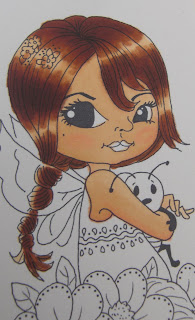
The image I'm using is called Tara by Victoria Case stamps which is available in rubber or on digi by request (Isn't she absolutely beeeeautiful!).


STEP 1
Colour in your skin colour with the Vanilla (or E00/E51) leaving a couple of areas blank as these will be lighter. Remember the more you colour over the darker it gets (to a point!)


STEP 2
Use the pastel pink (or E02) to add some shade. Now this isn't everybody's cup of tea for adding shade but remember this tutorial is for doing it on a budget!
STEP 3
Oh dear she looks a bit of a mess.... Patience Grasshopper :D
Pick up your vanilla again (or E00/E51) and push the pink into the flesh tone. Now some people do this in a circular motion, some zig zag or other ways whatever suits you best. Personally I'm a circular kinda girl so I colour in tight little circles over the pink whilst pushing it in. Leave bits exposed as above (part of the vanilla and part of white) whilst pushing your colour in. When its blended nicely colour right over it all including the white bits.


STEP 4
Using your pastel pink again (or E02) give her some cheeks. The skin you just coloured in will still be wet so you dont need much as it will bleed naturally into it. Go over the whole face with the Vanilla (E00/E51) again to blend the cheeks in. Don't worry about going over onto the hair when you blend as this will be covered up later ;)


STEP 5
Looking OK so far! Next we're moving onto the hair. On Tara you'll see 2 distinct "bumps" on her hair. This is normally the area the light will hit. You can add other light areas too or not its your call! So we need to go back to the Vanilla and colour in most of the hair except leave some white bands uncoloured.

STEP 6
Now to keep the hair blondish just keep building up the vanilla and add just touches of the brown. With copics you can touch the nibs together so touch the brown onto the E00 and scribble quickly onto scrap paper (to reduce the concentration of the brown on the nib) then start adding it.
OK so the rest of this tut is for brown hair as below. Pick up your brown (terracotta) and colour over the vanilla but not right to the edge, leave some vanilla and white showing.


STEP 7
Using your vanilla again colour over your terracotta/brown (I use an up and down stroke to push the colours into each other) Push a little bit more into your white bits.


STEP 8

You'll see the terracotta/brown changing colour as the vanilla dilutes it as in the pic below. Keep pushing into the white gradually.
STEP 9


Simples so far! Now add more terracotta leaving the white, vanilla and the blended bit so your terracotta should be a bit narrower this time. You can stroke the odd strand into the lighter bits now too.


STEP 10

Repeat this as desired for the depth of colour you want. When you're done push the vanilla right over the white. You should now be looking something like this. . .


STEP 11

Now I add smaller areas of terracotta without blending over with the vanilla and voila job done! Colour the lips in with the pastel pink and use a gel pen etc for the flowers on the hair.

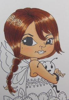
This (below) is the version done with copics. As I said previously if you don't have these colours just use what you normally would for skin tone and cheeks and add a brown of your choice!
ADDITIONAL
If after you've done the hair you've bled a bit onto the face just blend it in with the vanilla. If you have an even darker brown you can add a bit more depth by colouring over small areas of the terracotta.
The finished piece (I used rose pink for the lips and 2 blues and 2 greens for the rest) You can use other mediums to colour in the rest of the image but these 3 colours will at least get you started :)

Fav embellishment

The challenge this week over at Stamp Something is favourite embellishments. Mine has to be sticky gems! Since they made them ready sticky I've bought loads and then some! I never used to be bothered with the putting a dot of pva on so hardly used them in the past whereas now they're just so convenient they're a big hit with me!

I also made this for the Slam Dunk swap on Crafty Cardmaking yahoo group
Let me tell you a bit about our group.... Every month we have regular swaps which are a colour, a style and a technique. The slam dunk is all three of them combined into one so this months are blue and green, cute card and distressing. We also have a noobie swap for newer members and a digital swap or challenge using free digi images an ATC swap plus a project club and or JACK's (Jack's Art and Crafty Koncoctions!) Pop over to see us if you fancy joining in! We're VERY informal!

OK here's me card! Background paper is I dont know but it was a pretty blue/green marbly colour. The left hand side is a blue/green starburst stains creation which I stamped over in oasis green versamagic and distressed the edges. Image is by Victoria Case (Tara) coloured with promarkers (I've done a tutorial using this too which will be ready end of week) and the wings are shimmerz angel wings you can get from Quixotic
I did the flowers 3d and made the one in bottom corner with a circle punch, added SU ribbon and sticky gems :)