Monday, 31 May 2010

Crafty Cardmakers #22 - Least & Most

Challenge time again at Crafty Cardmakers and this time I'm wanting to see your Least and Most! That would be your most favourite colour combined with your least, should bring out some interesting colour schemes which you might actually like!

We're sponsored by Stitchy Bear Stamps who have a fab range of digis and papers available in their store. Stitchy kindly gave the team free choice of her range so for this challenge I decided to challenge myself a bit having never used a digital silhouette before as I'm a promarker fiend so I opted for "Watching You" and I've used blue as my favourite colour and orange as my least.

First I printed the image out onto card to test and my printer ink was running with all the inks I tried so I changed tack and carefully marked on a sheet of A4 card where the image would print, added a circle mask for the moon and used a brayer with a big and juicy inkpad (Beach Umbrella) to colour the card then removed the mask, heat set and printed the image directly onto it. I've hand drawn a rock and coloured with distress ink then I've then inked around the edges, stamped oak tree branch by stampscapes, gave it a spray with iridescent gold glimmer mist and added some sticky gems to finish.

In a nutshell step by step...

Step 1 - Print out your image onto a piece of paper and lay this over your cardstock, mark the cardstock where your image will print.

Step 2 - Place a post it note mask where you would like the moon to appear.

Step 3 - Use a brayer and ink your cardstock, remove mask, heat set and print your image directly onto it. Draw in extra elements such as a rock (optional)

Step 4 - Ink around the edges with distress inks and a blending tool creating a spotlight. Stamp oak tree branch around edges. Add highlights with a sakura pen (I have on the moon) Spray with glimmer mist and add sticky gems.
*Check the glimmer mist doesnt make your ink run on your scrap copy you printed out first!

Entering into...

One Stitch at a Time - Something new (Stamp)
Lucy's Cards - Digital
Flutterby Wednesday #2 - Open week
Totally Gorjuss - Wings


Sunday, 30 May 2010

The Stampman on Facebook

Hey hey thought I'd tell you that The Stampman now has a fan page on Facebook! Keep up to date with the latest happenings, products and Create & Craft shows, upload your pictures using Stampman products and chat with the team, ask questions etc!

You'll find us here!

Help me get 90 cards for Nan's 90th!

UPDATE (27 MAY)

I've had a huge response to this and I'm so touched! I have at least 90 sending and after discussion with the fab ladies over at Joanna Sheen's forum we've decided the more the merrier rather than turn anyone away!

I'm still passing on details to folk so if I havent replied to you yet I should do in the next few hours.

Thank You all, what a fab bunch of crafters you all are!

*******************************************


Its my nans 90th on 24th June (also miss mookins 2nd!) And she very rarely sees family except me. She's having a 90th in her local legion and she hates me buying her anything so I thought I'd ask around and see if I can get 90 cards instead as she can't scold me for that!

Her name's Doreen and she's a native of the Isle of Man but has lived in liverpool since her 20s,she likes gardening, flowers, likes my cards with cute bears on so anything along those lines would be great. She lost her daughter last year so I wanted to do something a bit special for her that she can't scold me for lol! She does love receiving cards and displays them for quite a while, I do plan to scrapbook them all for her too :)

If you can help me reach my target and make my nans day please email me for address!

Fankoo!

Thursday, 27 May 2010

A Touch of Pink

Isn't that a perfume?

I was in a really simplistic mood today and that included colours too so I went for my greyscale which I luuurve doing and added just touches of pink here and there. I've used my Ice Greys set of promarkers with pale pink as the touch, and my beloved blender.

The image is "Red Hearts" by sweet pea stamps and is from Crafts and Me here. Before I was on the DT I contacted Teresa about this one saying please please please with sugar and cherries on the top save me one of these when back in stock as she's just stunning and great fun to colour. There's lots of large areas on this and not too fiddly bits, havent coloured her in traditionl red/black yet as I'm still playing with her :)

ANyways yes, I've coloured with promarkers adding sparkly bits with a sakura stardust pen (clear) added sticky gems in clear iridescent and black for the buttons, black nailheads across the centre and heart shaped sticky pearls at the bottom. The black panel is cuttlebuged with jules jewells embossing folder and the pink layering is coloured with worn lipstick distress ink as is the labels 4 nesties panel.
The mirror I paperpieced with holographic silver paper. Now it wouldn't be me if it didn't sparkle a bit so I've used a glue pen and glamour dust on the gloves and bodice.

Entering this into....

Passion for Promarkers - Anything goes (Entry 2)
Flutterby Wednesday - Open week
Quixotic - Embossing
Cute card thusday - No dp's
The Secret Crafter - No Patterned paper


Thanks for looking! Love all your comments too, much appreciated x

Wednesday, 26 May 2010

Crafts and Me challenge #5 - Distressing

Its challenge time again at Crafts and Me blog and we're looking for distressing on your projects. There is a fab prize up for grabs from Clevercut too!

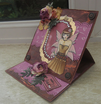
For this challenge I chose Black Rose Fairy which you will find at Crafts and Me here. She's coloured with promarkers with highlights using sakura stardust pens on the wings and roses. The background is, well its either moonshadow burnished brass or starburst stains cocoa bean coffee lol! I make batches and store them and forget what I've used so I suspect its the starburst stains which you can find here. I glued a sheet to a piece of card and distressed the edges with scissors. The pinky paper is core-dinations which I've cuttlebugged with the jules jewells folder and distressed with sandpaper. The centre panel is labels 4 and I've used gold mirri card and core-dinations which I've inked with vintage photo and scratched bits off.
The cute little tag stamp is from here
I've also added lots of iridescent sticky gems and on the belt I've used gold leafing foil - well even with vintage I've gotta have a bit of bling bling!

I hope you can come and join us at Crafts and Me for our distressed challenge which runs for two weeks.

Entering this into...

Passion for Promarkers - Anything goes
Totally Gorjuss - Bling it on
C.R.A.F.T - Birthdays
Stamp Something - 2 of something (Images, nesties, its an easel so 2 faces etc)


Sunday, 23 May 2010

Sweet Pea customer choice

A little while ago Lynette over at Sweet Pea stamps ran a bit of a competition to see which images by the talented Ching-Chou Kuik we would like turned into rubber stamps and the most popular 4 would be the next sheet of stamps made.
I suggested "Flowing in Blue" and then it went to a vote carried out on the sweet pea blog and it was one of the ones which got on woo hoo! It was the big eye that did it for me so I was quite pleased when Teresa at Crafts and Me sent me it to play with (fankoo muchly!) You'll find the stamp here!

I was in a blue mood today so have coloured the image with promarkers using powder blue, cobalt and china blue and the pinks were fuschia and mulberry. I've 3d' the butterfly and coloured using feather blending. The background I used distress inks in crushed olive (yum!) and weathered wood and edged in brilliance black and cut the image out using the labels 4 nesties - yes I have more nesties Fankoo Jill!!
I've mounted the image on pink core-dinations and distressed it lightly and have used a martha stewart punch across the centre distressed with worn lipstick distress ink which I also dabbed on the white paper roses and sprayed with iridescent gold glimmer mist.
The text sentiment is from Stamping All Day and I spotted Stamptacular Sunday was looking for pearls and swirls so thought yeah that'll do so added half a million sticky pearls including heart shaped ones next to the paper roses.

I actually started this card at 5AM, yep AM! Been tinkering on and off during the day, mooching round blogs and changing nappies inbetween and finally finished about 7pm!

Entering this into...

Passion for Promarkers - Fantasy/Mythology (well it would be rude not to seeing as its my favourite theme!)

Sir Stampalot - Butterflies and Blossoms

Stamptacular Sunday - Pearls and Swirls

Flutterby Wednesday - Use flowers


Friday, 21 May 2010

A card for a baker

Last week my little munchkins went on a teddy bears picnic and sponsored toddle waddle with their pre school (well its Ethans but Molly joined in too!). At the end they all received a medal (bless!) certificate and a shortbread teddy bear donated by our local bakery Sextons in Lymm. They also sponsored each child £2, very very generous of Phil & Sara!
As a fankoo I made an easel card for the school to give and wanted a baking theme. I've only got one stamp that is baking-ish which is too girly and the Tilda with the wooden spoon sprang to mind so a quick plea for help was answered by the lovely Amy who got some images to me rapidly! I really do have some wonderful crafty friends around blogger and the craft forums :)
Its an easel card made with mega nestabilities (curved rectangles) yes my teamie Debbie Dolphin is rubbing off on me here lol! Card and papers are from Stampin Up and I've made the flowers using this tutorial here on Inspirational techniques using a Martha Stewart doily punch, the kids paper crimper and papers by stampin up and some MOONSHADOW in ethereal emerald so its vintage with a twist :)
The flower centres have been distressed with peeled paint and vintage photo distress ink.
Image is coloured with promarkers using pear, marsh and olive for the greens and sandstone, caramel and touches of burnt sienna for the browns.
Entering into...
I love Promarkers - Make your own flowers
Papertake - Say it with Flowers

Fankoo for looking and any comments/questions! Much appreciate x


Moonshadow and stampin up tea and crumpets flubbers!

Thursday, 20 May 2010

Promarker Tutorial 2 - Hair

PLEASE ALSO SEE MY NEW 2012 SERIES OF PROMARKER TUTORIALS HERE

Following on from last weeks tutorial on skin & eyes which is here we're going to move onto the hair! I think once you've mastered these you can colour anything as its all in the blending and colour selection.


You can use any colours for hair but for dark brown as in this image I used...

A light colour for the blender i.e vanilla

A little bit darker i.e Caramel


A medium shade i.e burnt sienna


A dark shade i.e walnut


With hair and clothes you just need to identify highlight and lowlight points. In this example the highlight points on the hair look like bumps and the lowlights are dips.


Colour in your hair with your lightest colour (VANILLA) and leave the highlight points white as shown below.


Next take your little bit darker shade in this case CARAMEL and colour over nearly all of your base colour (VANILLA) leaving just a little bit showing.


Take your medium shade colour (BURNT SIENNA) and colour over most of your image again leaving part of the previous two colours showing.


Go back to your lightest colour (VANILLA) and colour right over the hair again and push the darker shades gradually into the white highlights you left. With a large highlight do this gradually and leave some white showing still, with a smaller highlight run right over it with the vanilla as seen on the smaller highlights at the bottom of the hair.


See how the vanilla washes the colour out and starts blending them together?


Next take your darkest shade (WALNUT) and colour onto the hair leaving quite big bands of the blended colours showing as shown below. The darkest colours really spread out when you blend them so if you only leave a small highlight point, when you blend it will drag too much of the dark colour over and disappear.


Blend this in with the VANILLA again pushing into the highlight points gradually.


Add more of your darkest colour and repeat this as necessary and continue blending in with the vanilla. I usually do this 2 or 3 times then when I'm happy with it I completely cover the white bits once with the vanilla and touch up the very lowest points with the walnut.


Here the hair is completed covering the white completely so that it blends in completely and looks quite natural. If you wanted to do blondes, reds, blacks or lighter browns just follow the same principal of lights, mid and dark so light blonde hair for example you could use ivory, primrose, buttercup and vanilla as the darkest.


You can also drop the 2nd lightest colour if you wish (Its a personal preference of mine as a way of making the colours more vibrant) so could do this without the caramel for example and just use vanilla, burnt sienna and walnut.


You can add sparkly bits with sakura stardust pens, copic spica or glamour dust and a glue pen (which I've done over a lot of the image here)

Blue hair & fantasy film wings with lots of sparkly bits added with a glue pen and glamour dust.

And the finished Tilda with lots of sparkly bits!

Hope you've enjoyed the tutorials and if there is anything you get stuck on just shout :)
Have a play with your own colour combos to find what appeals to you so stamp yourself some images out and just colour in a part of hair and write underneath what colours you used as if you like it you'll remember next time.
And the completed image folowing the same principals with the blending. The following one is the same with blue hair. Background was made with distress inks and a blending tool.

Monday, 17 May 2010

Crafty Cardmakers #21 - Inside Out

The challenge over at Crafty Cardmakers this fortnight is "Inside Out" so we'd like to see the INSIDE of your cards decorated! Now if you're anything like me you'll be a stick a white insert in kinda person but I have to say that cards decorated on the inside look amazing! Just a little bit of time spent on the inside can really add a special touch.


My inside - DP's are Stampin Up Tea & Crumpets with a martha stewart doily punch, iridescent pink ribbon and I've made the writing panel with plain white card edged with worn lipstick distress ink and sprayed with iridescent gold glimmer mist.

I actually spent an hour rummaging for papers that I thought would go nicely together before remembering I bought this pack last month *doh*

And the outside!
Stamp is Flying Fairy Tilda coloured with promarkers then everything bar the skin and hair glamour dusted and then sprayed with glimmer mist in Pearl.
All DP's are Stampin Up - Tea & Crumpets except centre panel which is white card punched with a martha stewart doiley lace punch (Thought it matched the bottom of the dress very well too!) then I've edged with worn lipstick distress ink and sprayed with iridescent gold glimmer mist.
Tilda is cut out from Nesties Labels 11.

I was in a sparkly mood and wanted to have a play adding it to the image with a glue pen. I had intended to do the wings and the dress and well it was all pretty and sparkly so I got a bit carried away lol! Got this Tilda from Sir Stampalot on Friday and I'm waiting for another one to arrive :D I'm swings and roundabouts with Tilda sometimes, some of them I loathe but the fairytales collection is *really* nice!


Also entering into...


Just Magnolia - One for the girls


Crafty Catz - Petals & Pearls


My Time to Craft - Tooooo cute!


Stampavie & More - Pink


Thanks for looking!

Thursday, 13 May 2010

Promarker Tutorial - Skin & Eyes

PLEASE ALSO SEE MY NEWER 2012 TUTORIAL SERIES IN THE TUTORIAL SECTION HERE

After much thought and being asked lots of time about the colours I use to colour faces I thought I'd do another tutorial for those with more than a couple of pens.

This tutorial is designed for people with a reasonable selection of promarkers as I use several.
The image I am using is a Sweet Pea stamp - Seeing Through which I selected as its a huge face area and eyes so you can see what I'm doing!

So are we sitting comfortably?

The colours I use for faces are....

IVORY (BASE COLOUR AND BLENDING)
BLUSH
VANILLA
SANDSTONE

Now then this is my colour choice for Sweet Pea stamps and more "realistic" images. If I'm colouring a more "cartoony" image such as magnolia I tend to swap the sandstone for oatmeal to make the skin more pinky.


You need to look at your image and decide where the light source is i.e the imaginary sun and if you've got the memory of a goldfish like I have then put a little mark somewhere away from the image to remind you!

I start off by colouring most of the skin tone in ivory. I leave a part white which is nearest to the light source.


I then colour over nearly all of the ivory with the blush again leaving the white bit (on the forehead in this image)


Next I use the VANILLA and create some darker areas so I've coloured over the parts I want to be the darkest leaving quite a lot of the blush showing and the white.


The next thing I do is go back to the IVORY and starting from your DARKEST colour (i.e VANILLA) blend this in towards the lightest colour. To blend simply move the pen in small circles or lines and push the darker colours inwards. Go over the bit you left white now and colour all over the skin.

See how the harsh lines blend in and disappear?


Next I use SANDSTONE to add shadows. If it was a Tilda or similar I'd use oatmeal instead which makes the image pinkier but sweet pea images I tend to do a more natural looking skin colour so I go for sandstone.
Add small lines of this in areas of shadow such as below strands of hair and along the face line as shown below.


Blend this in as before with your IVORY starting on the lines you just drew and working the colour in to remove the harsh lines then I've used PALE PINK for the cheeks (Most pinks are ok such as baby pink or sunkissed pink)

I colour in a triangle shape starting below the eyes as shown below.

Again using the IVORY I've blended the cheeks in and gone over the whole flesh area with IVORY to finish it off.


EYES
As eyes are usually quite small and the promarker nib is quite big then you need to be careful with small areas like this and literally feather the pen on the image. The harder you press down the more ink comes out so using a light hand colour in the iris part of the eye with the lighter colour (ARCTIC BLUE) leaving a small white spot as below. Use a light and a dark colour such as ARCTIC BLUE and AZURE.


Take a darker colour out (AZURE) and starting from the pupil colour in a small amount leaving the white spot and part of the ARCTIC BLUE showing as below.


Next use a BLENDER PEN and run over the eyes just a couple of times. This will blend the two blues together and tone down the white spot you left leaving a very pale shade of blue.
Hope this has been some use, I'll show the hair next week!

Thanks to Teresa at Crafts and Me for sending me the stamp to play with!


This one is a Tilda and I've replaced the sandstone for the oatmeal which gives a pinker look.
Also I tend to follow the shape of the face with the cheeks so the sweet pea is more of a
triangle face so I do the cheeks to match whereas Tildas are more rounded so I put big round
cheeks on and blend them less.

Wednesday, 12 May 2010

Crafts and Me Challenge #4 - Anything but a card

Its time for another challenge over at Crafts and Me and this fortnight it is Anything but a card. The DT have come out with some fantastic ideas for inspiration so pop over and have a peek!

We're sponsored by Sweet Pea stamps who are offering ching-chou kuik's Fantasy Art Collection sheet 9 and Amy at The Crafty Purple Frog who is offering 3 sheets of ching-chou kuik's digital decoupage.

For this challenge I've made a notebook using Sweet Pea's "It's my Birthday" stamp. I've coloured with Promarkers and highlighted with sakura stardust pens and I've given it a couple of squirts of glimmer mist in iridescent gold. The book covers are starburst stains and I've used a martha stewart punch for the border at the top.

Entering this into...

Creative Inspirations - Fairies
Papertake - Shiny, Sparkly & Special
Everybody Art - Make a gift
By the cute & Girly - Celebrations


Sunday, 9 May 2010

Port Sunny show samples

Hello to everybody who came over and said Hi to us on The Stampman stall at Port Sunny yesterday and gave us their support and fankoo muchly to Cath who stepped in whilst I got a promarker and sticky gem fix! I had a fun time and got mucky hands yay!

I brought some new pieces and did some demos on the techniques so if you can't remember them here they are :)

First one is bleaching starburst stains.
Paint a piece of cardstock, a heavier weight one works best such as 250gsm. Once you've painted on a full covering paint stripes across the page letting the colours mingle and puddle. In this example I have just used one colour which is gumbo gator olive from the mardi gras set. Dry this off with a heat gun and stamp and emboss your image. The image I have used here is from the Butterfly Beauties sheet was embossed with moonglow midnight copper embossing powder.
I have made another sheet using the same puddle method and sprayed with bleach (1/4 strong bleach and 3/4 water) and repeated as necessary.
The hair I have painted on a thin layer of bleach then used the blue from the mardi gras set and painted in the hair area. For the face I have painted on bleach and repeated until it was very light.


Sheet below shows the non bleached and bleached piece.

This piece I used starburst stains as watercolours and the cling film technique. To do the cling film technique paint a piece of cardstock with one colour then paint stripes or blotches using the same colour or add in more colours then take a piece of cling film and lay this across the wet sheet and push crinkles into it, put it aside to dry for a while. When you remove the cling film you will achieve affects as seen on the back of this post it holder.

I have watercoloured the Hero Arts flowers and used the Victorian Bouquet set throughout (1st set I bought!)

This piece shows the cling film technique and the effects you achieve.
And finally the distressed scrunch! Take a piece of plain copier paper, paint a base layer then drop splodges of other colours and scrunch! There is a photo tutorial here. In this example I've just used one colour (Hydrangea Blue from Victorian Bouquet) Dry your sheet off and swipe over the top with an inkpad, for the example I used a black brilliance but you can use distress etc.
To get the crinkles flat (some like to keep them others dont) then use a wet glue such as a pva or glue stick on the back of the paper and put some onto a piece of card and flatten them down. You can stamp on this, cuttlebug it or use it as design papers as below.

Hope I've given you some ideas and if you bought some or have them sitting in the cupboard then off ya go with them and have sparkly fun!

Friday, 7 May 2010

One more sleep!

Till Port Sunny!

I'm prepped and ready to go, I will be alternating demos with Jill on The Stampman stall throughout the day except for a couple of escape acts to meet up with KCUK group! I've only done one demo before and not at this pace but I think I'm ready for ya! Cath from KCUK has said she'll come and heckle hehe! If you're going come say Hi!

Will post some piccies after I've recovered when I get home!

Wednesday, 5 May 2010

Different mediums to colour sweet pea stamps

As promised last week I'm going to show you a couple of different ways to colour sweet pea stamps that are quick and effective and can be done within 10 minutes each. I've chosen Faraway Moon which is available at Crafts and Me.

First up we're going to use distress inks. Now you don't have to use distress you can use all kinds of ink but make sure its a dye ink not pigment as pigment is thick and will cover your stamping.


First off stamp your image in a waterproof ink such as stazon then take a light colour inkpad (I've used Spun Sugar distress ink.) Swipe the inkpad right over the image building up a good coverage of colour.


When you've built up a good coverage of colour give it a rub with some kitchen towel to even it out and dry it off.


TIP!!! If you want to have some sparkle in your colouring then use an aqua brush or have a little pot of clean water then use the artquest stargazers watercolour paints you'll find here. Drop some water into one of the pale colours like white or yellow until its at the brim and give it a quick stir so that the mica floats into the water then suck it up into your aqua brush or use a pippette and drop this into your small pot of water which will now sparkle. Try not to disturb the actual paint cake as you'll pick up too much of the pigment rather than the mica.

Take a darker distress inkpad and water colour in the hair (I used Victorian Velvet) and use a pink colour such as tattered rose for the flesh. Simply dab your inkpad down onto a non porous surface like a craft mat or piece of acetate and pick up the colour with your brush.


If an area seems too dark then wipe the brush clean of ink and just use water (or sparkly water!) to wash out areas you want lighter or highlighted. I also dab quickly with a piece of kitchen roll to remove excess water and colour.

You should now be looking something like below, see the sparkle from the water :D

Continue colouring your image, I've used the stargazers paints to colour in the moon.

Next I've used a blue distress ink (chipped sapphire) dabbed onto a blending tool and starting OFF the paper start bringing the colour inwards towards the image with a small circular motion.

Let everything dry and trim down to suit (Mine is ATC size) I've also edged the image with a gold dabber paint which I've also dabbed lightly onto the flowers.

Next one is using just the stargazers watercolor palette to colour in the image. They work on light and dark card for different effects. The palette does cost around £20 but I've had mine since 2004, used often and not even a third of the way used! There is also a little mixing well in the centre and this set has all the primaries with black and white so a huge range of colour is available from one set. I'll also show you a little trick with it in a few days when I'm less manic lol!

For this one I've stamped onto black card and embossed with a white embossing powder. I actually think this looks quite good as it is for monotone cards!


Ive then used the stargazers watercolours to colour in the image. It doesn't photograph too well but when you turn the card all the colours flash up like the pink for the skin (there is a red and white in the palette, add a touch of bronze and you have a skin tone) The white on the moon is dazzling and everything sparkles :) :) :) :)

Add a little bit of embellishment and bling bling and you have another topper ready for a card or made into an ATC in 10 minutes flat!

Hope these have been of some use to you and shown you alternatives to marker pens :)